IE < 9

Please update your browser for better experience

Loading

UX audit (part1)

  • GA,UX tools
  • 2025

It's my solo project. I led the Senior UX researcher and web analyst of the project for marketplace for selling cars and trucks- Autoline.ua. I led efforts to create comprehensive list of issues and solutions.

    My tasks:
  • Effecrively track user flow and user persona
  • Collaborate with designers, developers, and other stakeholders to implement changes and improvements.

Problem 1: Complex Filtering

What Happens?

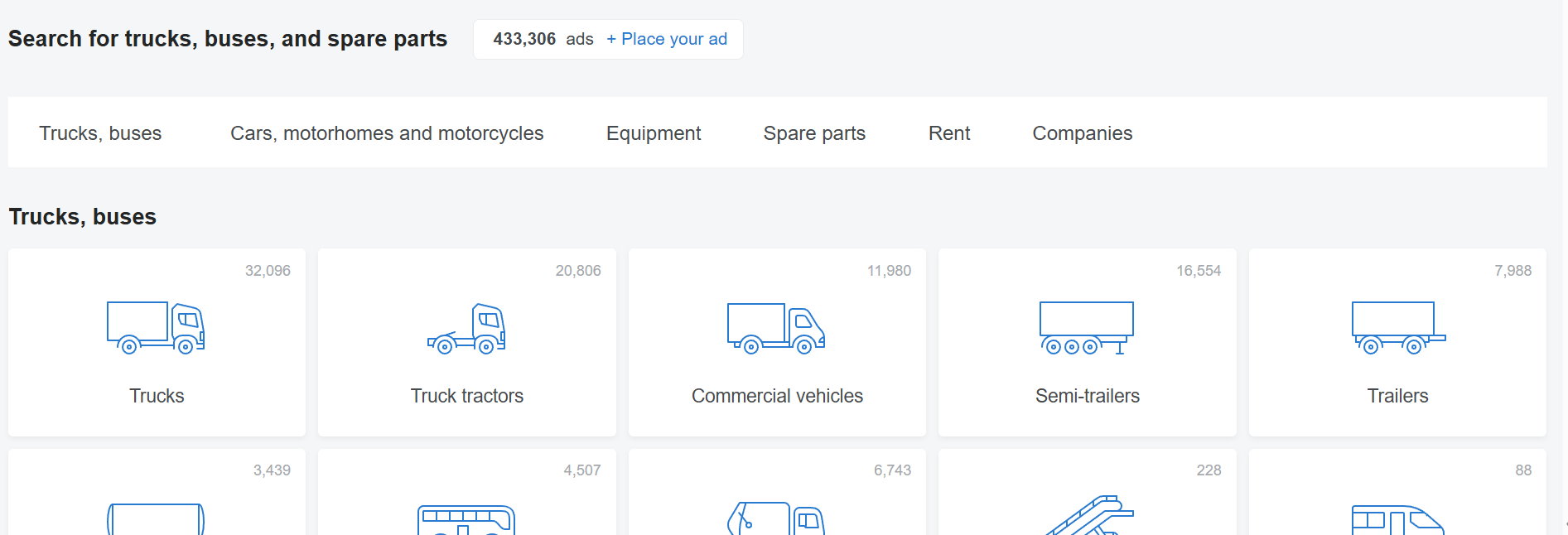
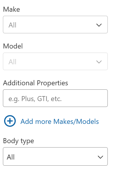
A user visits the site to find a specific truck. They open the filters and... get lost in the sheer number of options. Too many parameters, unclear categories, and a lack of logical structure make the search process difficult.

Why is this a problem?

Jakob's Law: Users expect interfaces to work similarly to other platforms, but a complicated and unique filtering system confuses them.

Hick’s Law: The more choices available, the harder it is to make a decision. Overloaded filters increase cognitive load.

How to Fix It?

  • ✅ Make filters more intuitive by grouping them into key categories, as implemented on AutoScout24
  • ✅ Add preset search templates (e.g., “Popular Models,” “Up to 5 Years Old,” “Best Deals”), similar to Cars.com
  • ✅ Simplify the interface with the ability to quickly reset or modify filters.
  • ✅ Use progressive disclosure by showing additional filters only when needed.

For security and confidential reasons, I can't write information about the company's name and data. All data collected for this case study was changed and show only tendency, but provided data is not real.

Problem 2: "Add to Favorites" Button is Unnoticeable

What Happens?

Users want to save listings they like, but the “favorites” icon is too small and unclear. As a result, many users either copy links or forget about their preferred listings.

Why is this a problem?

Violates "Fitts’s Law": Small elements are harder to click, especially on mobile devices.

"Aesthetic-Usability Effect": If the interface looks unintuitive, users perceive it as less usable.

How to Fix It?

  • ✅ Increase the size of the icon and make it more contrasting, as seen on Avito, where the “Favorites” icon has a clear design and stands out.
  • ✅ Add animation when adding to favorites (e.g., color change or a pop-up notification), similar to Zillow.
  • ✅ Show a tooltip on the first hover over the button.
  • ✅ Place the button in a more obvious location, such as next to the title or price.

Problem 3: High Bounce Rate Among New Users

What Happens?

Visitors come to the site but leave quickly. Why? They don’t immediately understand that they can buy or sell vehicles. The homepage is overloaded and doesn’t clearly answer the question: “How do I find what I need?”

Why is this a problem?

Violates "Cognitive Load Theory": Users receive too much information at once and can’t process it quickly

"Serial Position Effect": The most important elements (search, categories) aren’t always placed where users first look.

How to Fix It?

  • ✅ Improve onboarding by adding pop-up hints or a mini site tour, similar to Airbnb, where new users receive a step-by-step introduction to the platform.
  • ✅Optimize headlines and CTA buttons to clearly convey the site’s value.
  • ✅ Add a "Popular Categories" block for quick navigation, as seen on Amazon.
  • ✅ Move key elements to the top of the screen and make them more prominent.

Autoline is a powerful platform for finding and selling vehicles, but several UX issues hinder users from effectively engaging with the site. By improving filters, favorites functionality, mobile usability, and onboarding, the site can increase engagement, enhance user experience, and most importantly, boost conversion rates 🚀.

Quick track to connect

Telegram Icon Telegram LinkedIn Icon Linkedin Email Icon E-mail